Naming
“Kenpath Labs” is two words, capital K, capital L, never “KenpathLabs” or “Kenpath labs”, and never shortened to “Kenpath”.
Usage
Give the mark room to breathe, clear space of at least half its own width on every side. Don't recolour, redraw, rotate, or add effects to it, and don't rebuild the lockup in another typeface. Use the variant drawn for your surface: dark assets on dark grounds, light assets on light ones.
Wordmark
Use the full lockup wherever space allows. Each variant ships transparent, and solid with its own background baked in, for surfaces that ignore transparency.

Logo
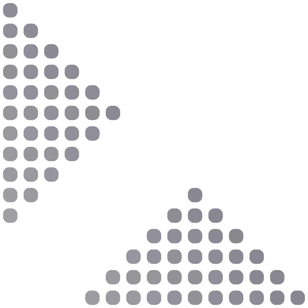
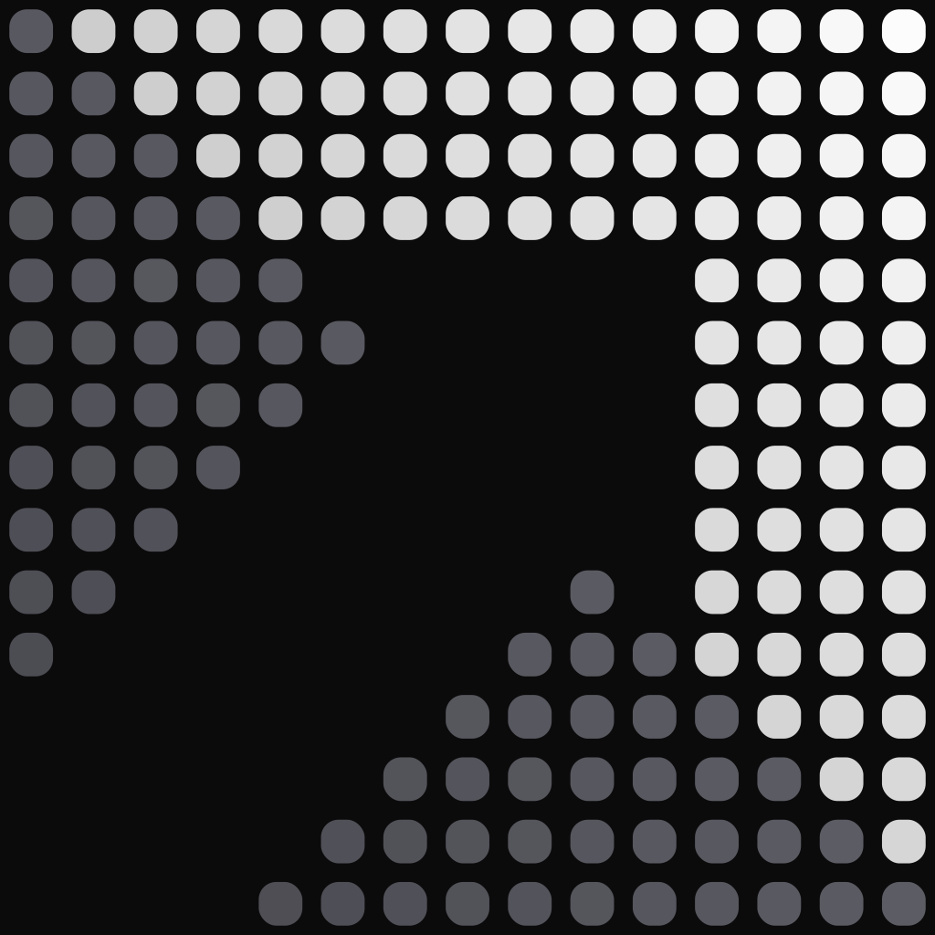
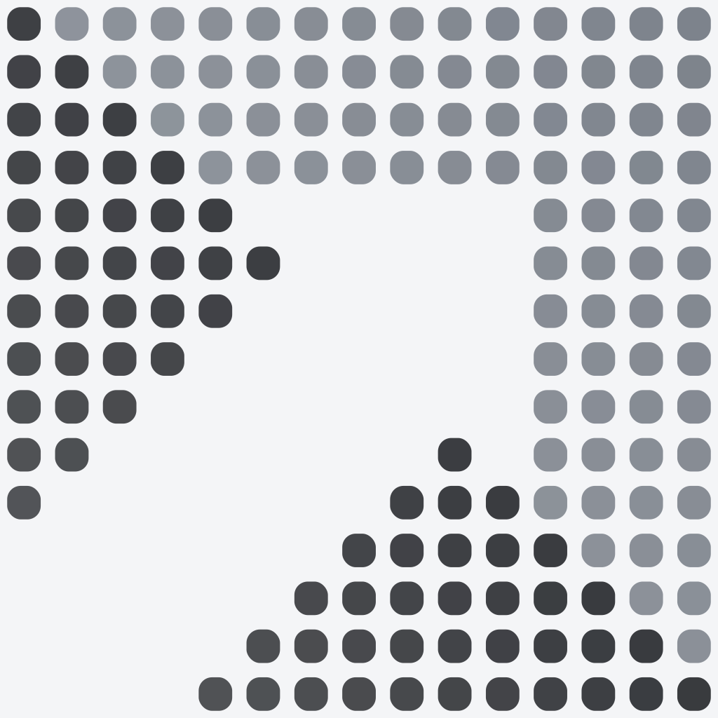
The dot-grid mark, for tight layouts. It ships at three densities, the grid coarsens as the render shrinks, because at 16px a 15-dot grid collapses into noise. Use the master at 64px and up.


Icon
Board-backed, for surfaces that ignore transparency, app tiles, social profiles. The file is square; platforms round it to their own radius.




Colours
Near-monochrome, one warm accent. Marigold is rationed, a highlight, never a fill.
Everything above, plus every size and favicon, is in the asset download. Questions, hello@kenpathlabs.com.